So colour is a part of making that I find hard. Possibly the hardest. I have the feeling I am not alone in this, so I thought I would tell you about the little colour journey I have been making over the last year, and what I have found that has been helping.
Unlike other parts of crafting that may involve using technique or a pattern where I know what to do, colour feels a bit unknown, a bit unsure. I lack a bit of confidence and so spend far to much time thinking about what to do. Which annoys me. Especially because more and more of the things I am doing, involves making colour choices – be that knitted colourwork or quilting. And so, for the last couple of years I have been trying to figure it out. Trying to learn some more about colour in theory, but also about what it is that I like colourwise. I still need a lot more practice – but I have found some things that have helped with the process of choosing colour, that I thought I would share with you.
But first, as always, a quick description of the problem. So, I go into the fabric store searching for something particular for a project. While I am there, something bright and shiny captures my attention and I do the odd bit of purchasing. I come out with a stack of shiny things that make me happy on the day. A week or three later, I might be inspired by some wonderful persons style on the interwebs and think "right-o, I’m off to the cupboard". But there is nothing there I want to use. It is all too patterned, too bright, too XYZ. I look around my home or in my kids wardrobes and they are full of bright patterned things. I want to use something calmer/bluer/more-neutrally but that doesn’t translate on purchasing day for some reason. Which means a cupboard of bright and shiny. And then, because I feel I should use what I have, I then make with what I have. Bright, patterned (and also pretty) but not necessarily the direction I would really like to head. I need to put in more thought and more planning.
And then there is my wardrobe. I had a pile of small kids (3) in just over 4 years which meant that I went from having a wardrobe I liked, that was full of colour (still mainly blue but colour none the less) to wearing black trakkies and a black maternity top almost day in day out for a year or three. Yes – I (sadly?/happily?) admit I was that woman covered in sick with a exhausted shocked look on her face for a few years. So now I am out the other side, but I am still trying to figure out what I like wearing again. And it is tricky. I find myself being super safe and/or just plain lazy. And I want to fix it, which means I need to fix my colour issue. I have an entire wardrobe that is just blue. Safe, boring, gorgeous blue.
These two issues sound almost contradictory but they kindof aren't. I've lost my confidence that I will choose things I will like in a year. And I feel like I keep buying either things that are safe - or the complete opposite where I break out and buy something that is a too shiny/crazy/bright. Arrrghhh....
And then there is the issue that colour is a much trickier proposition for crafters (as opposed to artists). Even when I take the time to figure out what I want, I can't necessarily get it. Artists are often able to mix/make the colour they want. Crafters are often limited to the colours they can buy (and yes of course you can dye but I'm lacking the time at this stage of life). Sometimes you want that particular shade with just a little more XXX to it. Incredibly frustrating or a limitation to be worked with?
So without further complaining, here it is.....
Lessons I have learned that help with colour
1. Your visual diary is key
I wrote the post a little while ago about how all crafters need a visual diary and this is where it gets super useful. I do two things on pinterest that really help. I keep a board called craft – colours where I pin random things where I love the combination of colours. I go to this board for inspiration whenever I am starting a new project. While I am there I also edit this board to try to find images that stand the test of time.

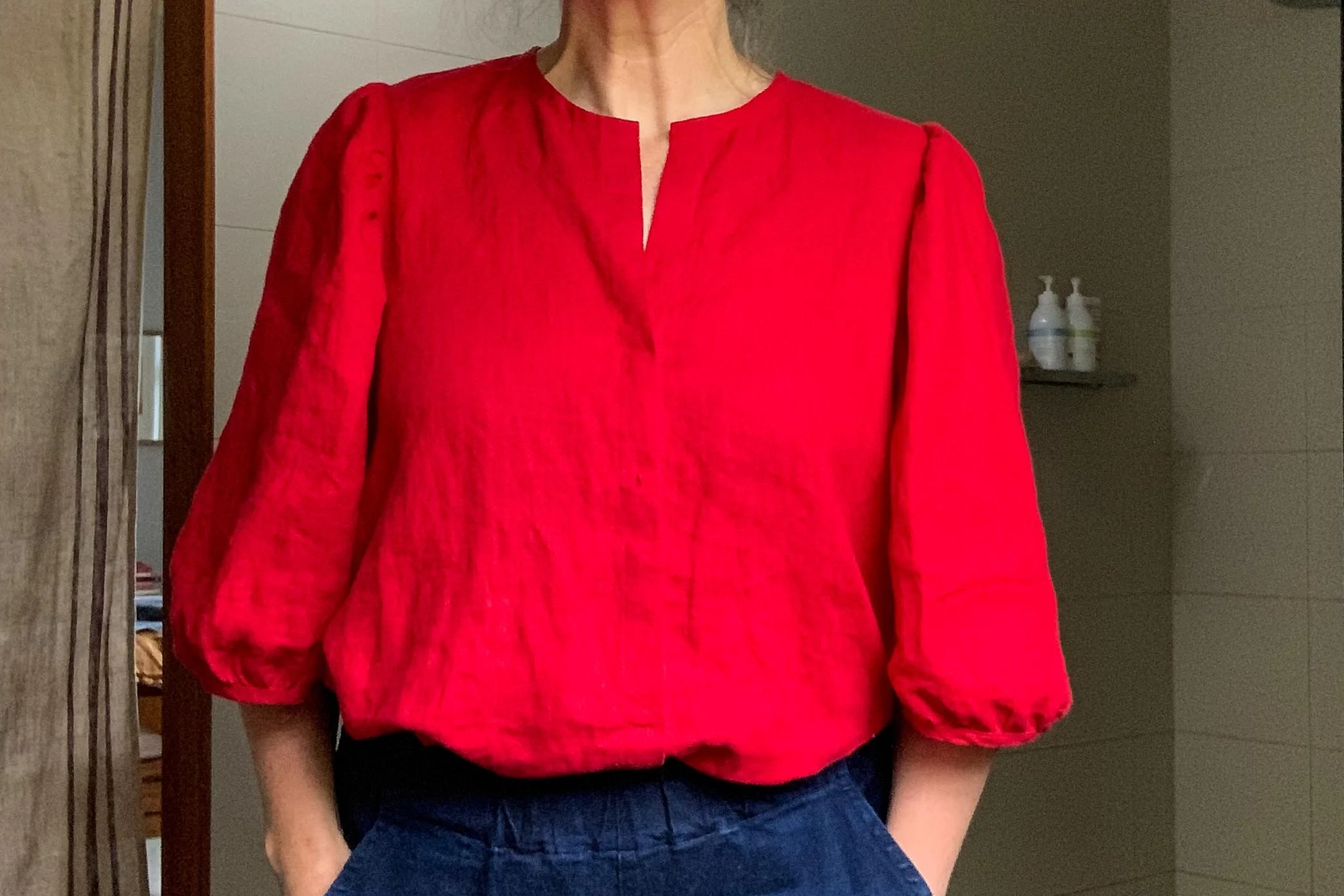
Trying to work some colour back into my summer wardrobe. Still a bit stuck on the blues.....at least it is a bit brighter??
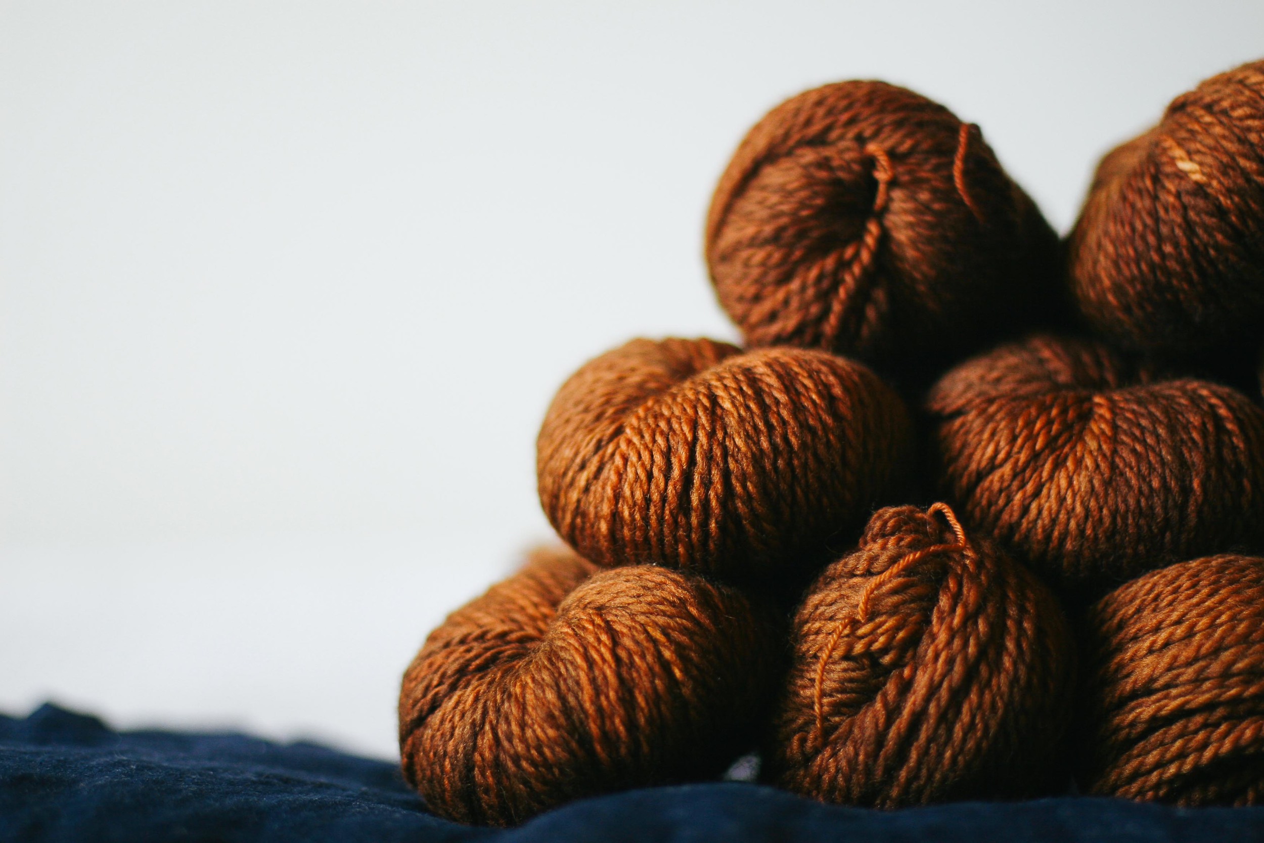
Clothing-wise my main colour loves haven’t changed that much over my life, but I also know that I get comfortable. I get a bit scared of branching out – which leads to boredom and then wildly inappropriate purchasing when I feel the need to be less boring. Urgh. What is needed is some considered thought. The alternative is to stick with the blue/grey thing I have going on - which I am feeling is no longer an option. Pinning on the colour board and then combining the ideas I find with the ideas found on my clothing board are helping me to look at other things I might like. One of my latest purchases includes a sweaters worth of dark orange/rusty wool (in the top photo) to make Cinnamon Girl based initially on this image. And I have just made a lovely orange Lila (no proper photos of my version but there is one on instagram). Over time I have found more and more images on the page that have this type of combination. I think I may love it. Controversial choice for me - and choosing this involved a bit of bravery and a bit of thought - and a bit of time to make sure that orange/rust wasn't just a passing phase.
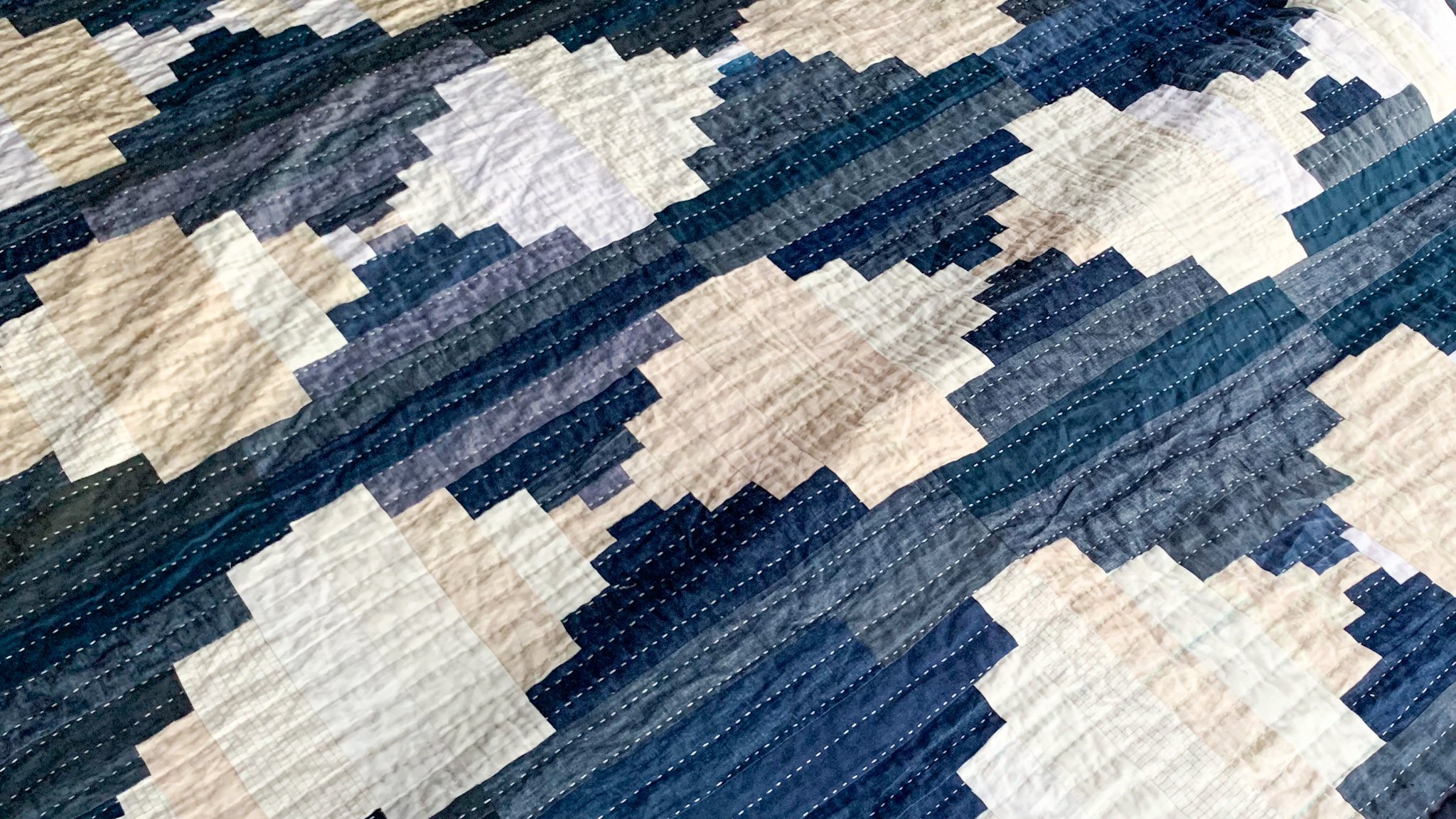
The other key thing I have started doing is going through boards like the textiles board or my clothing board and analysing what themes are common. For example by looking at my textiles board I have realised that I like particular types of quilts that a fair bit of contrast or a clever use of value (see below).
I am also using it to choose quilt colours that sing. Once I have a project in mind I then also use the pretty colours board to see if there is something that grabs me as a starting point.
2. Develop your ideas before you start
Anna has been working on me about this. Crafting isn’t art. You aren’t doing a painting whereby you may be able to paint over a mistake. When you are quilting or sewing you are often cutting your fabric up. And cutting means more consideration is needed before the project starts. By doing this you can avoid costly fabric errors.
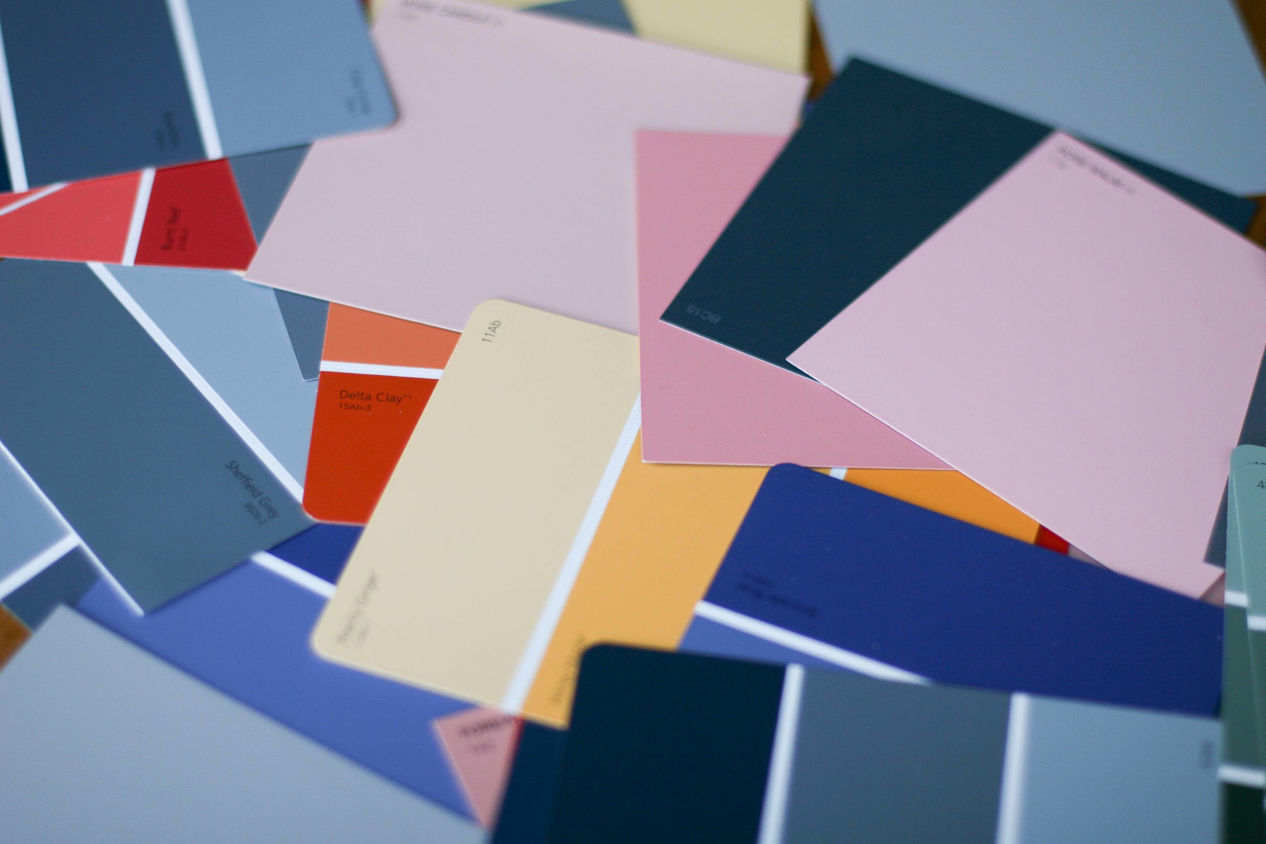
Anna suggested that the way to go about developing an idea involves mocking it up using any artform you are comfortable with. Draw it, colour it, paint it and for me she came up with "collage it" (drawing and painting aren't my strong suits). I was sent off the the paint store with my existing fabrics to collect swatches that matched. I could then play around with other swatches to determine if I could find some that worked. Due to the aforementioned limitation around colour choice this will involve some flexibility but at least I would then know what I was aiming for.
The other thing that this process allowed is for development of the form of the project. When sewing a garment I know what the finished garment would look like – I’m working to a pattern often. With the development of a quilt this allows me to look at shape, proportion and form before cutting into precious fabric.
3. Value is important
One of the key things about colour theory for crafters is often value. This is especially true when talking about colourwork for crochet or knitting and for quilting. Simple way to do this is to take a photo with your phone of the possible choices of yarn or fabric and then turn it to black and white. Then you can see if you are getting the contrast (or not) that you want. The quilt below is a great example. The value of the lighter too fabrics is too similar for what I want to do but I am was a bit stuck. I'm stuck with the fabrics as my kid chose them and they are what I have. So instead I was playing around with proportion to try to get a better balance. It's not working.

Mocking up these quilt samples with colour chips has actually clearly showed me that they don't work which is mainly due to value. There is too much similarity between the two lighter colours. Now I need to renegotiate colour choices with my small person!
4. Colour theory is useful but don’t get stuck on it OR Trust your instincts
So when I initially went looking for an answer on what was the perfect (;)) colour to go with what I had and bigger than that – how to choose colours for a project that sing – I looked quite hard at colour theory. And I found it useful – complementary, harmonius, tone, value etc. Interesting even. You should investigate it and see what you get out of it. There are may useful things to learn.
But the answer to my particular colour problem doesn’t lie with colour theory. Because, as the lovely Penelope pointed out to me, when she found me amoungst the paint chips of the floor of our local hardware store
“There isn’t one answer Felicia. There are lots of answers!”
And if I am doing all the other things – using a visual diary, developing my ideas on paper and considering value, thinking a little about colour theory, then really I just need to practice and trust my instincts on what looks right.

So there you have it. My findings on what has helped me - hopefully something in there that will help you in your colour journey. I would love to hear any other ideas you have .....I'm always on the hunt for new ideas!!
Felicia x
Note: We are currently working on the next round of classes for The Craft Sessions Sept 2014 and I am going to be asking each of my teachers – where appropriate – to give you their individual takes on colour theory. What they use and how they use it within their crafting practice. I can’t wait to hear what they have to say.